stocks

More Sentiment Info and Institutional Asset Manager Positioning Extremes

2/27/23

February is almost over, not nearly as intriguing as January from a returns perspective!

The 10 month moving average for the S&P 500 is about 3947 so I’d like to see us close again over that level for two months in a row, that tends to be a pretty positive outcome but the inflation and Fed data seems to be pushing markets around at will.

Positioning was quite extreme and bearish at the end of 2022 and we saw a wicked ramp in January. Since that time, AAII sentiment has ripped back with stock prices going up but with the correction, sentiment has fallen back down to lows. Perhaps everyone is correct but after 30 years of investing, I’m a bit wired to be more positive when the masses are very negative and extreme. Timing is everything though.

Here’s an interesting chart showing buying of VIX calls has gone vertical and back to levels not seen since March 2020, close to the Covid lows. People are clearly bearish and/or positioning with VIX calls to hedge their longs. Honestly, I don’t think that’s a bad trade given VIX is back under 20, I think VIX and markets could be rangebound for a bit longer as the data and Fed chop around.

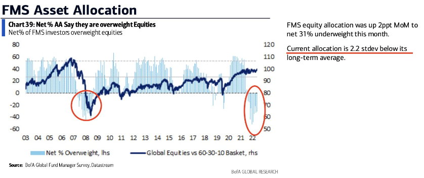
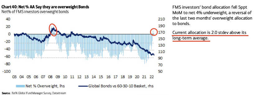
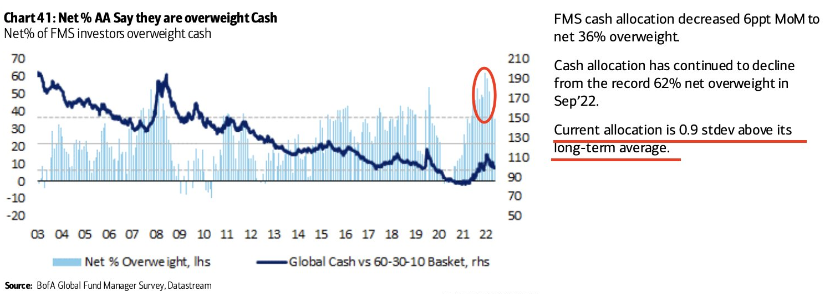
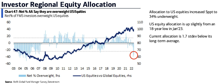
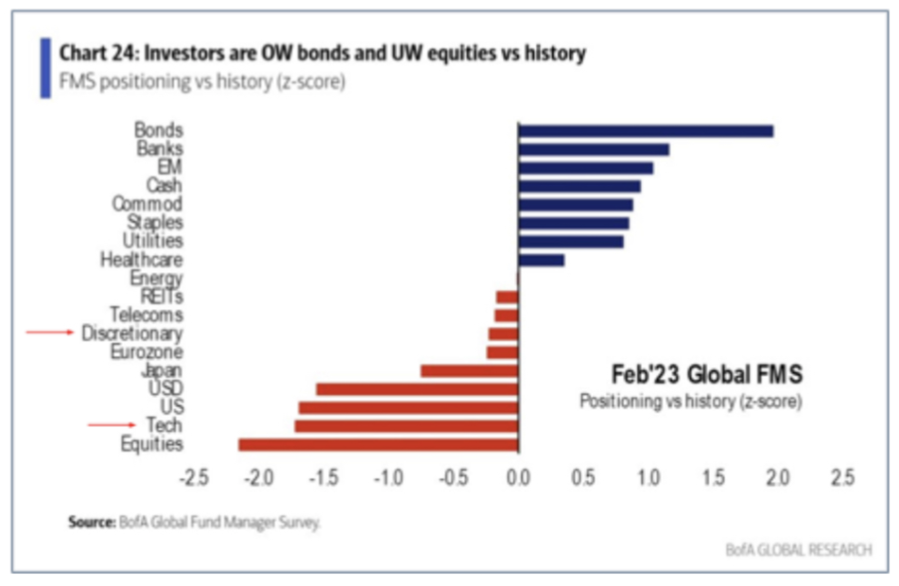
Here’s the February look for institutional money managers, again VERY bearish stocks, Tech in particular as rates have risen back to highs and markets have gotten soft again.

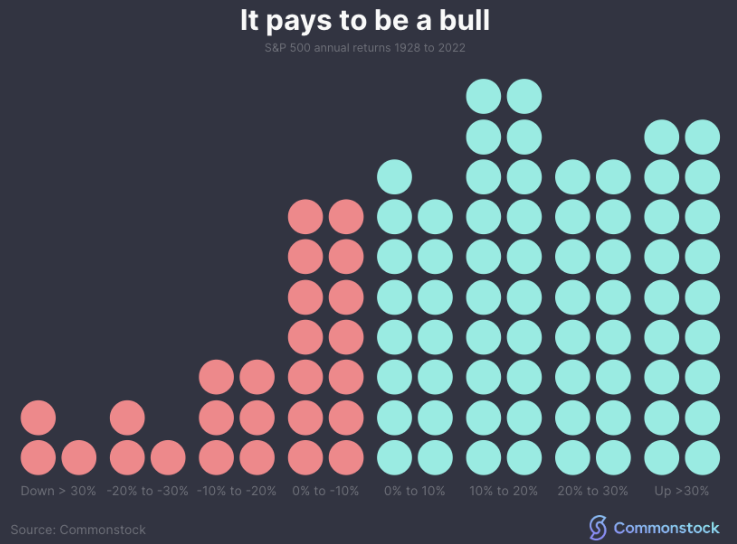
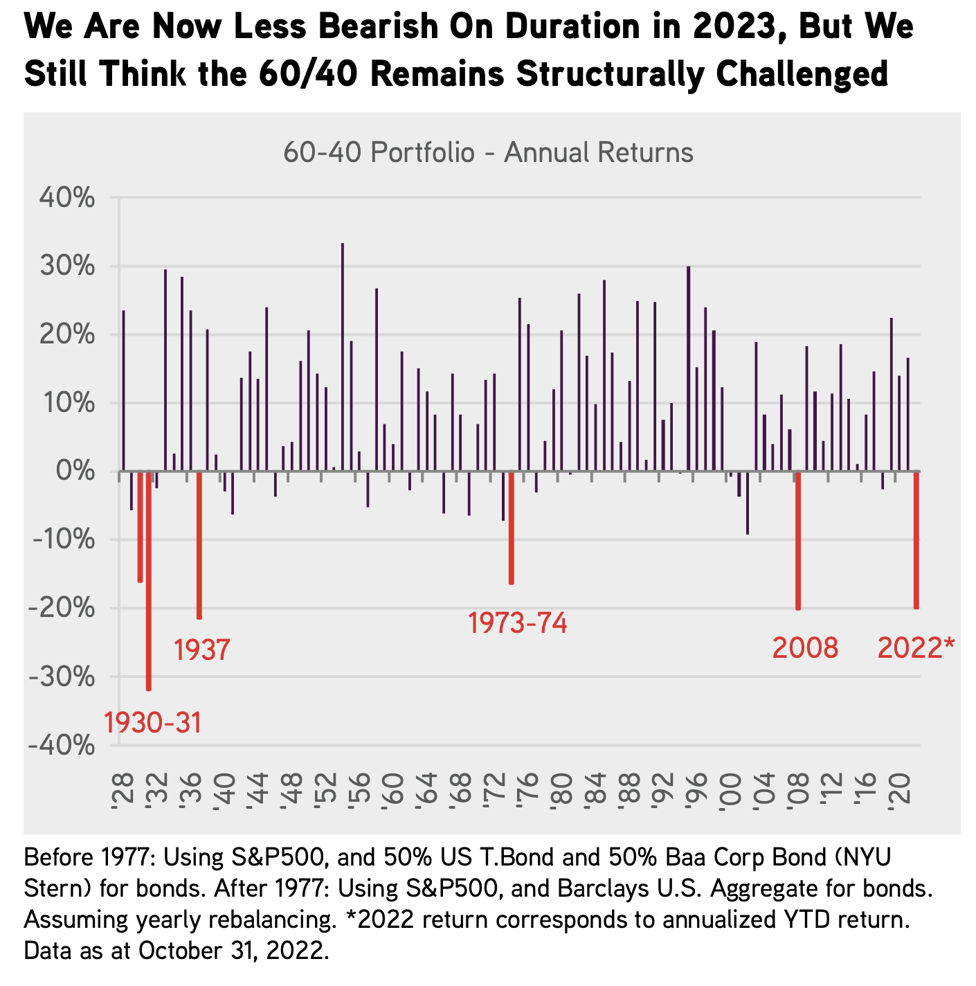
I understand people do not want to lose money, or age, or get shorter as they age, or get slower as they age, but the reality is: it happens. Stocks don’t always go up, they can be volatile some times, the markets act unbelievably irrational at times because human emotions drive decisions along with computers that just trade on very short-term momentum signals and key words. The most successful investors understand VOL is part of the package and they use VOL, when it appears, to their advantage and they add to their favorite long-term holdings at better prices. That’s what you are supposed to do, so while the market is digesting this epic “normalization phase” directed by the Fed, just keep accumulating more shares of your favorite companies. This betters your cost basis, and gets you bigger in names you love. That helps you sleep at night. Remember, if VOL and big swings keep you up at night, you don’t have confidence in what you own, you may be too exposed to the asset class in question, and/or you may just be thinking too short-term. Here’s a little reminder, the odds for being long and invested are overwhelmingly in your favor if you have time on your side. Stocks are positive the bulk of the time and they rarely cluster around “average”, which is about 10% a year pre the ZIRP madness of 2009-2022. If you have some funds or ETF’s that have 1 & 3 year returns well under the long term average, that’s likely telling you it’s time to build bigger positions unless you’ve picked some crazy strategies. We focus on household consumption and business investment through the most relevant and leading brands. That’s a $44+ trillion a year thematic so I feel quite confident we are fishing in the right pond.

Sentiment and Positioning Still Offsides?

There are a ton of data points to assess each month to give us some idea of where risk-taking appetite is. Extreme positioning is the only thing I look for though. For the last few months, there was some extreme bearishness and positioning which led me to take more risk and add some tactical high beta brands to the portfolio. I’ve since sold those for some great short-term gains. Looking at the January data, positioning is still a bit off-sides and tilted toward being defensive, holding more cash, owning more bonds, and owning less US stocks. Bullishness towards European and especially Emerging Market equities is high, I’ve faded that move a bit by selling the Hermes and Ferrari for now, while trimming the LVMH big position. I’ve added some defensive exposure via healthcare brands UNH, REGN, and LLY with the funds from sales in higher beta and luxury brands. I like the balance I have right now.

Here’s the BofA investment manager positioning data. I love seeing these monthly, once in a while the positioning extremes jump off the page and offer some real tactical trading opportunities. For now, I like adding to US stocks with the high quality balance sheet & GARP style factors present.

Still 2.2 standard deviations BELOW long term equity positioning average

Still 2 standard deviations ABOVE long term bond positioning average

Still .90 standard deviations ABOVE long term cash positioning average

Still 1.7 standard deviations BELOW long term U.S. equity positioning average

Interest rates and inflation are normalizing, why it's not as scary as you think

The road back to normal has been rocky. How do I know? Just look at most investment portfolio’s YTD. Very few asset classes have been spared, the typical 60/40 portfolio has performed more poorly than most other periods over the last century. Even if the seas will still be turbulent for another 2-4 months, better times lay ahead.

Investors must decide how to allocate for the next 1,3, and 5 years with a new normal in mind. The rate & cost of capital environment since roughly 2008 have been abnormally low when one looks back over the last 60+ years. Because ZIRP has largely been in place since 2008, to many, it feels like the norm but in reality, it is the exception. Here’s where we are now: we know with certainty; the Fed wants to normalize rates after holding them artificially low for over a decade. Man-made inflation gives them air-cover to do so. Every consumer and every investor needs to have a grasp of history in a higher rates and higher inflationary period. With that in mind, I wanted to offer some perspectives & only the facts. The last 16 years with zero-rates and abundant access to capital at almost zero cost is gone. People’s muscle memory needs to be re-set asap. Currently, the bears will say this reality makes it difficult for asset price appreciation so rather than opine with an opinion, I wanted to look back in time to see what happened in other periods when rates and inflation were higher. The data source for  Fed Funds & CPI data come from the St. Louis Fed website and the S&P 500 data are from Bloomberg.

If I was a betting man, I would guess the next 5 years looks like a Fed Funds average rate of between 4-5% and a CPI that averages 4% which just happens to be in-line with the long-term ranges. Here’s a graph showing how the smart professionals at KKR see the next few years. In short: growth is generally fine and inflation metrics mean revert towards long-term norms.

Conventional wisdom states, when GDP peaks and falls precipitously, asset prices also fall. Logically, it makes sense but sometimes markets have their own plan. Here’s a very interesting datapoint I found shocking when doing this exercise.

GDP peaked in 1984 at 7.24%. At the end of 1984, Fed Funds was 8.38%, that’s TWICE what it is today but those were wild times. CPI was 4%, likely where we expect it to be for the next few years. GDP generally fell into the 1991 trough of -0.11% before rebounding to 3.52% in 1992. If I told you what GDP would have done between 1984 and 1991, you would have guessed the stock market got absolutely crushed right? Below are the actual results. Intuitively, we know markets discount the future in advance and the market fell about 26% from the peak Fed Funds around 15-19% from late 1980 into Q3 1982. That was a very different time than we expect in 2022-2025 so I take odds with people expecting similar outcomes from a very different economy and set of variables.

Period: 1984 Peak GDP to 1991 Trough GDP: 7.24% Peak GDP to -0.11% Trough GDP

“Consumers are tapped out”. That’s a very popular phrase today and has been popular for about 70 years.

The truth about consumer spending is more nuanced as you might guess. When we feel good and are flush with cash, we spend more and do more discretionary purchases. When we are nervous or have less cash in our pockets, we make important decisions about what is vital and important and what spending can be deferred. With very few instances over time, consumer spending does NOT fall very much. To illustrate this, below is the long-term chart of Personal Consumption Expenditures and then a very condensed period when Fed Funds & CPI was very high. The assumption is when rates and inflation are high, consumers get squeezed and spending falls along with stocks and asset prices. The period in question is 12/1/1978 to 12/31/1981. When this period started, Fed Funds was a whopping 10% and CPI was 9%. I’ve listed 1978-1981 first. IN the 1980 recession, consumption fell but it was by no means a “collapse”. Spending is in a consumer’s DNA.

Here’s a wider lens chart of consumption and GDP over a tough period for inflation, 1968 to 1981 with recessions annotated. The line is very clear, it keeps going up and to the right. And remember, Millennials and GenZ are two population cohorts that are bigger than baby boomers and they are sitting in their peak earning and spending cycles for many decades and inheriting over $40 trillion over the next 20 years. It’s hard for me to imagine spending falling on a consistent basis given this positive demographic factor that few take into account. Heres the consumption chart from 1968 to 1981, CPI averaged 7.6% over this 13+ year period. Up and to the right.

In today’s volatile times, I think it’s important to remember, the storm happens during the “normalization” process which for rates and inflation, is well under way. At a new Fed Funds range of 4.25%-4.5%, we are well past 2/3 of the way to our longer term destination. Because rates and the cost of capital were artificially held too low for too long, there will continue to be zombie companies floating to the top over the next few years. Please make sure you move up in quality, focus on positive and growing free cash flow businesses and avoid companies that need access to capital to fund operations, that capital is alot more expensive today. I am a huge fan of the Private Equity brands currently because they will feast on the carcasses of the companies that ran their businesses like free capital would never end.

Below, I have highlighted a handful of periods that show what more normal periods look like in monetary policy, inflation and GDP, particularly to compare them to the most recent period starting with Ben Bernanke in 2006, then Yellen, and now Powell. As you can see from the image directly below, from 1955 to Bernanke’s arrival at the Fed, normal fed funds was around 5.5%, normal CPI was about 4% and stocks provided an attractive return. In the next chart, we look at the abnormal period we have all become accustomed to where fed funds is ultra low, CPI is ultra low but equity returns are elevated. On the surface, this looks like a better solution, but the rampant speculation and funding of terrible business models and mis-allocations of capital ultimately end up being more destructive than a more logical range of monetary policy with an appropriate cost of capital. What’s the moral of the story? Investors should expect more normal equity returns than what we think we deserve. We still have a bit of normalization to go, so we should expect volatility to linger for a bit longer, but once we are at a normal place and the rules of the road are more well known, asset markets should settle down and macro won’t be as front & center. Ultimately, its company fundamentals that drive stock prices. History shows, stocks do just fine in periods with higher cost of capital, higher interest rates, and higher inflation than we think is “normal”. Why? because shitty businesses find it hard to get funding, and markets purge the bad and feed the good. Here’s the data:

Normal Fed Policy & Inflationary Period: 1955 to February 2006 when Ben Bernanke Arrived at the Fed

Unsustainable Fed Policy - ZIRP & Free Money Period: Bernanke, Yellen, Powell Period: 2006 - Today

An Example of Normal Policy via the Greenspan Era: 1987 to 2006

Below, I have outlined 5 periods with Fed Funds & CPI ranges most similar to where we are now and likely to stay over the next few years. Spoiler alert: Stocks performed just fine. Once the market get’s more comfortable with the terminal rate, stocks should bottom and revert back to “normal trends”, if history is a guide.

Period #1: 7/1/1963 to 11/1/1968

Period #2: 8/1/1970 to 1/1/1973

Period #3: 3/1/1975 to 8/1/1977

Period #4: 5/1/1991 to 5/1/2001

Period #5: 8/1/2005 to 1/1/2008

For fun, let’s see the statistics for an elongated period of higher Fed Funds & inflation so we know how markets performed in an outlier period relative to “normal”.

High Inflation-Fed Funds Period: 9/1/1977 to 4/1/1991 over 13 Years

How has the stock market performed when EPS was between 10% & 25% LOWER than 1 year prior?

Very interesting stat from Ned Davis research showing the S&P 500’s annualized gain as a function of quarterly EPS growth.

Turns out, the best periods of stock performance ironically happen when EPS growth is between -10% and -25% as a YOY change. So with the world expecting 2023 to be a low growth or recession year, driving lower EPS growth, the bear cases which seem to be the consensus view currently, could be the best outcome for stocks!

That will make a bear choke on his dinner.

Chart Pack: Savings, Inflation,

Today, I want to post a handful of interesting charts with global implications. In a world filled with opinions and biases, I’ll try to anchor to data and then we can extrapolate the future with better accuracy.

First, inflation is a global phenomenon, it’s different country to country but it’s present everywhere because bad policy is everywhere. This is man-made inflation folks, very little of this is has NOT been born out of politician intent and/or poor policy and over-reactions to Covid. Charts are from Alpine Macro. Not only does this first chart show you where inflation is but where any recoveries from it could be most robust if/when it eases.

Now, let’s talk savings vs private investment. We have all seen the data from the U.S., savings rates went parabolic during the Covid idiocy and as expected, savings rates have normalized and gone even lower as high inflation causes consumers to eat into their savings to maintain consumption habits. We also know that consumers are already making purchase decisions and have shown a willingness to defer consumption in non-core, non-favorite categories. This will continue and it will take a little time for consumers to build back up their savings once inflation does cool off. For now, I would avoid the 2nd, 3rd, fourth tier brands and categories in a world where we are making real purchase choices. The first chart is the U.S. and then we have Japan with the reverse situation (it’s a cultural thing and they love luxury goods), then we have the Eurozone (falling but still overall high savings), and then China (my goodness it’s not a matter of IF but when they begin their revenge spending). Again, luxury spending looks set to rip back in China at some point. The top Chinese brands should be getting some real snapbacks in spend coming.

Today’s retail sales was strong, e-commerce very strong, nominal numbers always look great in inflationary, higher priced environment. What could hurt spending going forward: continued high food costs, continued high overall inflation across most purchase items. wealth effect deterioration (home prices and stock market woes). Debt usually is not a sign of health so some slowing in spending should be expected. Brand relevancy matters more now than ever.

Lastly, a few great charts from @CharlieBilello on Twitter. U.S. credit card balances have risen sharply, in part because of having alot of consumption capacity and in part because consumption habits haven’t changed but the ability to pay on time has changed. Not an ideal situation and very skewed to the lower income cohorts. The next chart shows the savings rate getting back to 2008 levels. Yes, it’s bear porn but just remember, in 2008 the consumer was much more levered up as a percent of total disposable income and they were flipping houses and acting like it was 1999, I simply do not see that kind of behavior now. Maybe Crypto was the replacement? Remember, the value of crypto was about $3 trillion and so far, >$2 trillion has been shed. Lots of Crypto-Bros in Miami not so happy these days.

What's the future look like AFTER 25% drawdown years?

Some great info from Miller Opportunity Trust, Bill Miller’s old shop. They are aggressive and having a really rough year but I suspect adding some cash to a strategy like this and others like Brands will reward people very well. And for now, no one wants anything to do with stocks, those are generally pretty good buy signals. And most importantly, buying stocks when markets were down 25% didn’t nail most bottoms but it didn’t matter if you had some fortitude to buy and hold great businesses through the storms.